Webinar Registration Page – 7 Secrets to High-Converting Landing Pages

What if I told you that making more money on webinars isn’t always about more sales but instead, about increasing your webinar registration page conversions?
Here’s the thing, in 2019, webinars continue to hold people’s audiences more than any other platform. More than Youtube, more than Google, and more than any social media platform.
Recently, GoToMeeting released a survey that found the average audience viewing time for a webinar is an astonishing 57 minutes!
In a world where the average person has a shorter attention span than a goldfish, this is quite an impressive accomplishment. While this is a great statistic, you can’t get your audience to stick around for nearly an hour if you never get them registered.
Before you start to share your story and provide tons of value to your audience, you need them to get registered for the event. Creating a high-converting registration page is one of the most important parts of building a successful webinar funnel. Even a 10% difference in getting people to register can have a massive impact on your business.
Watch this video to learn more webinar registration page tips and examples below:
7 Webinar Registration Page Secrets for Success
Write an Eye-Catching Headline
The headline is the first thing that people will see once they land on your registration page. The headline must do a few things.
First, it needs to be catchy. Boring headlines won’t get the job done. Also, you need to create a headline that mentions exactly what someone is going to get by attending the webinar. Preview the biggest lesson you will teach them during the event.
I’ve found that “How-To” headlines and “X Things That Will Solve X Problem” seem to convert the best. Here are a few registration page headline examples from current Easy Webinar clients:
- Want to Learn Exactly How to Sculpt a Physique Athlete’s Body on a Vegan Diet? – This headline is from Kim Constable who generated $1,000,000 in revenue from one webinar in just 15 months!
- Get Kids to Listen Without Nagging or Yelling – This headline is from Dave and Amy McCreedy of Positive Parenting Solutions. It’s simple, clear, and tells their audience exactly what the webinar will teach them.
Your landing page headline should be compelling, catchy, and speak in the language of your audience. This is why it’s so important to do plenty of research on your avatar so you can use the right wording.
Here are a few other examples of effective registration page headlines:
- The 3 Behind The Scenes Secrets to Digital Course Success
- How to Make 6-Figures In Any Niche Using This Simple 3-Part Formula
- How to Create and Execute Your First $500 Automated Webinar Funnel
Don’t Forget a Sub Headline
The next part of the registration page is your sub-headline. Your subheadline should expand on the promise of your headline.
The goal of your subheadline is to give a more thorough description of what the webinar is about. You want to describe who the webinar is for by calling them out directly. For example, if your product caters or coaches and course creators, mention it in the subheadline.
Here are two subheadlines from expert marketer Amy Porterfield who is a master at webinars:
“My Proven 3-Step System for Levargin The Most Powerful, “What’s Working Now” List Building Strategies, Even if You’re Starting from Scratch”
“How to Build, Launch, and Grow a Thriving Digital Course Business Without Hiring a Big Team, the Constant Overwhelm or the Momentum Crushing Question, “What the Heck Do I Do Next?”
Here is another example of a perfect subheadline from Dave and Amy McCreedy. They even bold and underline exactly who the webinar is for:
Webinar Headline
“Get Kids to Listen Without Nagging or Yelling”
Webinar Subheadline
“For frustrated moms and dads who are sick of YELLING…tired of power struggles…and desperately want to improve their parenting skills.”
Use a Promo Video
Once you’ve created your headline and sub headline, I suggest creating a short promo video for your registration page as well. Your promo video doesn’t need to be very long either, a minute or two is perfect.
Your promo video should introduce you, the webinar topic, the pain the audience is facing, and your solution. This will allow you to show off your personality and get them excited about the workshop.
Nail Your Messaging
To create a world-class registration page, you really need to nail your messaging. Like the subheadline, want to speak to your target audience in the words they use to describe the problem they are facing.
The more you know about your audience, the easier it is to write compelling copy on the sales page. You want to speak to your audience directly and go deep. Don’t just use surface level pain, go to the core of the issue so you can tap into their emotions.
The formatting of your message is important as well. Don’t write long paragraphs of text as it’s hard to read, especially on mobile devices.
Instead, use bulleted copy to let people know what they will learn in the webinar without overwhelming them. The goal is to tease your webinar content without oversharing in your bullet points.
Show Off Testimonials
After telling registrants what they will learn during the webinar, it’s time to show some social proof that you are the right person to teach them. Make sure to leverage testimonials from people who have attended and worked with you.
You want to add a picture of the testimonials and a few lines of persuasive copy from people who have found success working with you. Or, you can screenshot messages or conversations from past clients as well.
Try to include 2-3 testimonials on your registration page as they will help people trust you and help them relate to past clients.
Use a Clear Call to Action
One of the last steps to creating a webinar registration page is to have a clear call to action. Do you want users to click on a button? Fill out a form? Watch your video?
If you don’t tell your audience exactly what to do, chances are they won’t do it. Again, make it simple and easy for them to sign up.
Make It Easy for Attendees to Register
The final step is to make it easy for them to sign up. You don’t have to have more than three fields in any given form. I see so many new webinar users have four or more fields and it turns off the audience. Filling out that much information seems like a lot of work so a lot of people never end up doing.
Instead, have two or three fields to increase your registration page conversion. The main things you need are their full name and email. A third field I would add is a phone number. This way you can send them SMS reminders to help increase show-up rates.
Webinar Registration Page Examples
Sometimes it’s helpful to see the example instead of just tell you what to do. Here are some examples of effective registration pages to give you something to model.
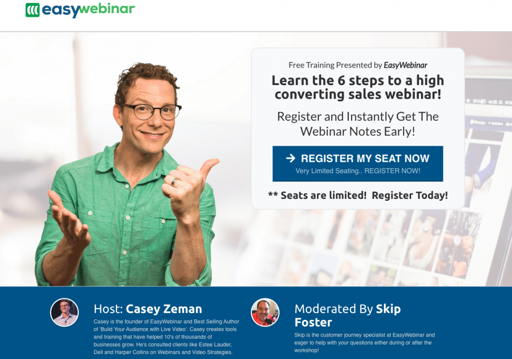
Webinar Registration Page Example – EasyWebinar
Let’s take a look at one of our webinar pages to show you how we optimize our webinar registration page.

This is the top of the registration page and it does a few things well:
- Clear headline
- A simple call to action
- Creates urgency several ways
- Previews my authority as a webinar expert
Here is another great registration page example:
Webinar Registration Page Example – Positive Parenting Solution
Dave and Amy McCreedy are the founders of Positive Parenting Solutions. They have used webinars to help scale their online courses and help parents worldwide.
Here’s an example of their webinar registration page:
Once you click on the “Register Now” button, you get this popup to get registered:
This automated webinar clearly states what the topic “Get Kids to LISTEN Without Nagging, Reminding or Yelling” and offers the benefits “Begin Transforming Your Family.” It’s clear, simple, and easy for people to get signed up. Plus, there are only three fields to submit your information including a phone number.
Webinar Registration Page Summary
Don’t forget, webinars are still the best ways to educate your audience and sell your products. But you can’t do either if you never get them registered. Make sure to read this again if you are just starting out or review your current webinar registration page based on these strategies.
Remember, a good webinar registration page shows the “How-To” do XYZ for your intended result. Give your audience a clear result from attending the event. Also, the workshop itself is just an extension of your course and program as you can only teach so much in 60 minutes.
Lastly, on the registration page, don’t position the webinar but instead, position the endgame of your course. Highlight the transformation they will receive in your course, not just from attending the webinar. Remember, your online course will move them but the webinar is the first step in their transformation.
Use these tips to create a top converting registration page and get more people to attend your webinars. Don’t forget, with Easy Webinar we have pre-made templates that make it easy to create excellent registration pages as well.
Check out Easy Webinar pricing now!


